Color In Design
Understanding the complexities of color and material pallets
In the dynamic world of architecture and interior design, the use of color is much more than just a matter of aesthetics; it’s an intricate balance of perception, light, and context. Developing color palettes for projects that embody a holistic vision without feeling constrained or dogmatic is nuanced and complicated. Here we delve into the complexities of color in architectural and interior design, exploring how different factors like texture, light, and individual perception play crucial roles.
The Role of Lighting
Lighting, both natural and artificial, is likely the most important player in color perception. Natural light is renowned for its ability to render colors accurately. However, it’s important to remember that the color temperature of natural light changes throughout the day – warm in the morning, cooler during midday, and warm again in the evening. This shifting quality can dramatically alter the appearance of colors in a space throughout the day.
Artificial lighting, on the other hand, can render colors differently. The quality of color rendering varies significantly among different artificial light sources. We’ve discussed this in detail in our article on Color Rendering Index (CRI) and its importance. It’s crucial to understand how different lighting conditions will interact with your chosen color palette and not only plan for noon on a sunny day, but also understand how a pallet will appear in these different environments.
Adding to the intricacies of lighting’s impact on color, the orientation of surfaces plays a pivotal role in how light interacts with materials. How light falls on a surface can dramatically alter the perception of color, depending on whether the application is horizontal or vertical. Horizontal surfaces often receive light more directly, intensifying the brightness and hue of the color, while vertical surfaces tend to receive light at an angle, subtly altering the perceived color.
The Interplay of Texture and Color
One of the most important aspects to consider is how texture influences the appearance of color. For instance, a matte tile and a glossy tile might be glazed with the exact same hue, yet they will appear distinctly different. This variation is due to the way light interacts with different surfaces; a glossy surface reflects more light, often making the color appear more vibrant or lighter, while a matte surface absorbs light, giving the color a deeper or more subdued look. Understanding how materials of different textures and reflectivity will interact will affect how we approach pairing materials.
Contextual Impact on Color
Nothing is perceived in a vacuum and materials can not be selected or understood in isolation – the pallet needs to be considered holistically. Contrast and the influence of neighboring materials is vital to understanding how the material will be perceived. As something might appear gray next to something white, it might appear more brown next to something blue. A material’s color can be perceived differently based on what it is adjacent to.
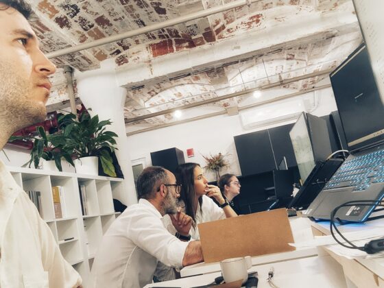
This phenomenon is why working with actual samples is vital. Renderings or online catalogs cannot accurately reproduce what a material will look like in person. Moreover, observing these materials on-site is crucial to understanding how the palette will react to the specific lighting conditions of the project.
The X Factor… You!
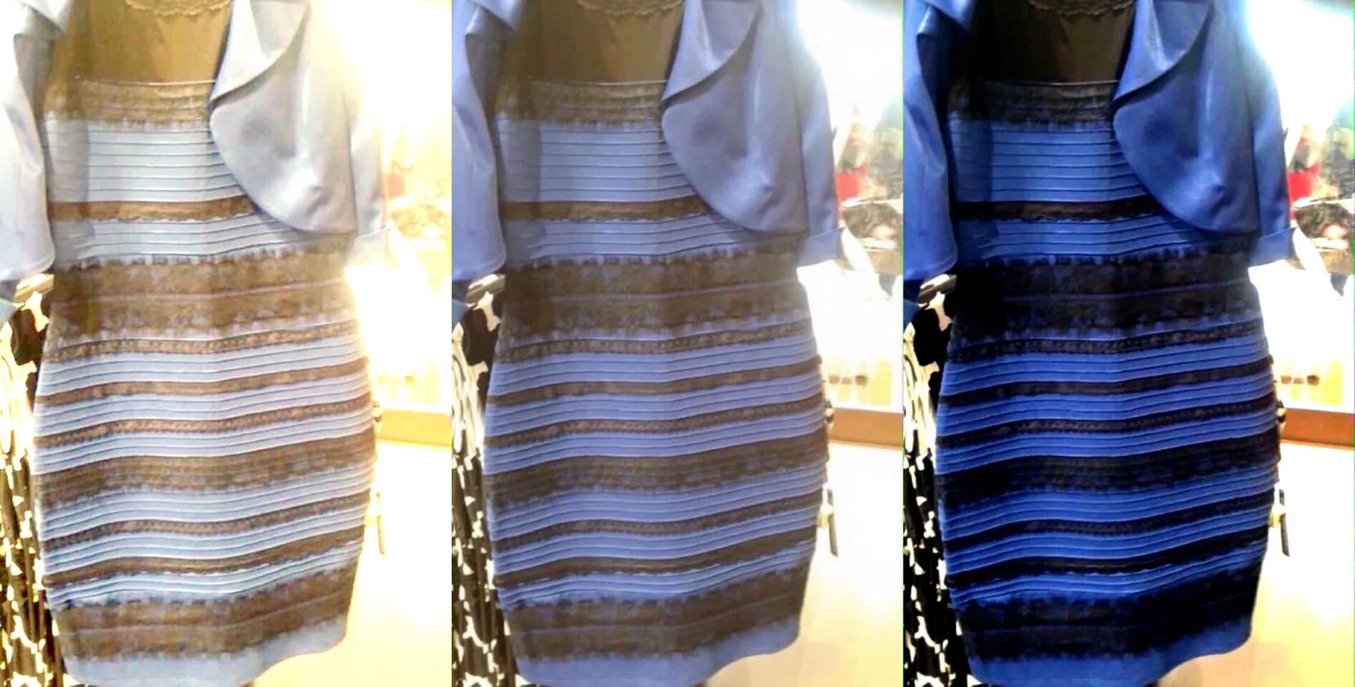
The subjective nature of color perception also plays a crucial role. An interesting fact to note is that, on average, women can perceive a broader range of colors than men. Remember the viral debate about whether a dress was blue or gold? Such phenomena highlight how individual differences in rods and cones in our eyes lead to varied color perception, influencing personal preferences in color combinations.
Creating a color palette in interior design is an art form that blends science and perception. It requires a deep understanding of how colors interact with textures, light, and their surroundings, as well as how they are perceived by the human eye. By considering these factors, designers can create spaces that are not only visually appealing but also resonate on a personal level with their inhabitants.
Stay tuned for more insights and remember, the world of color is as complex as it is beautiful. As always we advise that you embrace the journey!